How to choose color or grayscale
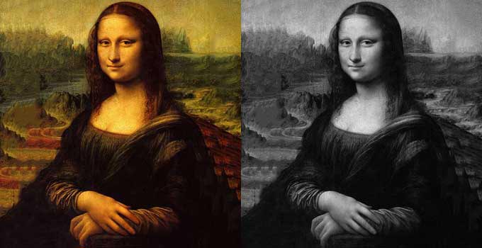
Grayscale printing is what we think of as black and white printing. We’re essentially applying little black dots to white paper. More dots
make a dark gray, fewer make a light gray. Ms. Lisa on the right up there is made up of thousands of these little black dots. There are more
dots in her dark hair and robe than in her lighter skin and the sky.
Color printing uses dots too but in four specific colours - Cyan, Magenta, Yellow, and BlacK – are what’s called CMYK color, or “process
color" and by mixing these shades commercial printers will produce all the vibrant shades needed for full-color pictures. Commercial book
printers use this process. By using dots of these colors mixed together, printers can quickly produce the vibrant shades needed for full-color
pictures.
Consider profitability
I think we’d all agree that books look more striking in color, but they need to make a profit too. So when deciding what makes sense for your
book think about what it really needs. Would grayscale printing do justice to everything that makes it special, or would color printing make a
crucial difference? A book entitled “Famous Paintings” is going to rely on masterpieces displayed in their full-color glory. But what about a
book called “The Da Vinci Biography”? Would color still be better?
While a grayscale printer uses a single layer of black ink, a color printer uses four layers of colored inks. For this reason, color printing
typically relies on thick, coated paper stock. This is needed to prevent the sheer quantity of ink from wrinkling up the paper. It’s also
necessary to stop the images showing through on the other side. Add it all up, and this means color printing is always more expensive. As a
rule of thumb, the same book will typically cost 4-5 times more to print in premium color than it would in grayscale. So, if the grayscale
book were $5, the premium color version would be $22.50. Many POD services also offer an inbetween option called standard color on ordinary
paper stock, so less ink, colors appear duller. This is good for something like a business book to add color to the odd line drawing or
diagram but not typically considered sutiable for photographs.
Consider popular choices
The type of book you’re creating will often give you some clues as to whether color or grayscale is the way to go.
Novels always favor grayscale. Readers of novels are put off by a high price tag, so it’s extra important to
keep costs as low as possible.
Non-fiction is more subjective, making the author’s decision that bit harder. Non-fiction books can be grayscale,
2-color, full-color, or grayscale with a few colored inserts. It all comes down to whether the book would benefit from some added interest.
A reference textbook called “Learning to Speak French,” for example, might help engage readers by using color
illustrations. “Advanced C++ Programming,” on the other hand, is unlikely to gain much from full-color images. Using 2-color printing could
add a little variety and help highlight the most important points. Workbooks designed to be filled in by students are likely to stick to
grayscale and use cheaper uncoated paper. Ask yourself: what will readers use your book for?
Coffee-table books are almost always full-color. Readers buy these books specifically to pour over glossy pages
full of high-quality photographs or artwork. The only exception to this would be a book of black and white photography where color isn’t necessary.
Children’s books use bright colors to help draw their young readers’ attention. Older readers may be happy with
grayscale illustrations, but for younger readers, it’s a case of the brighter and more colorful the better.
Know what your printer offers
Most Print on Demand (POD) digital printers provide grayscale or full-color printing. However, your printer may not offer every book trim
size and binding type for both grayscale and color printing. Make sure you check all your options with your printer before you set your heart
on any particular aspect. Non-POD services typically provide much more flexibility. They might offer the option of inserting colored plates
as a block between pages of grayscale text. Printing in 2-colors or 3-colors are also typically available options if you’re printing a batch
of books with a lithographic printer.
Think about your content
Finally, it’s time to think about the words and pictures you plan to use in your book. Weighing up everything we’ve run through so far;
do they really need color? Do you think most your readers will be happy to pay more for the pages to appear glossier and more attractive?
Or would they be less likely to buy it when they see the higher price? If you do decide to go for grayscale, it’s important to go back to
your manuscript. If you’ve been busily preparing it all in color, you may need to make some changes. It could be you’ve color-coded diagrams
or referred to “the text in red.” Will amending this change your readers’ understanding? What other consequences might removing colored
elements have? This last question can be a tough one to answer so if you’re not sure, ask your book designer for help.